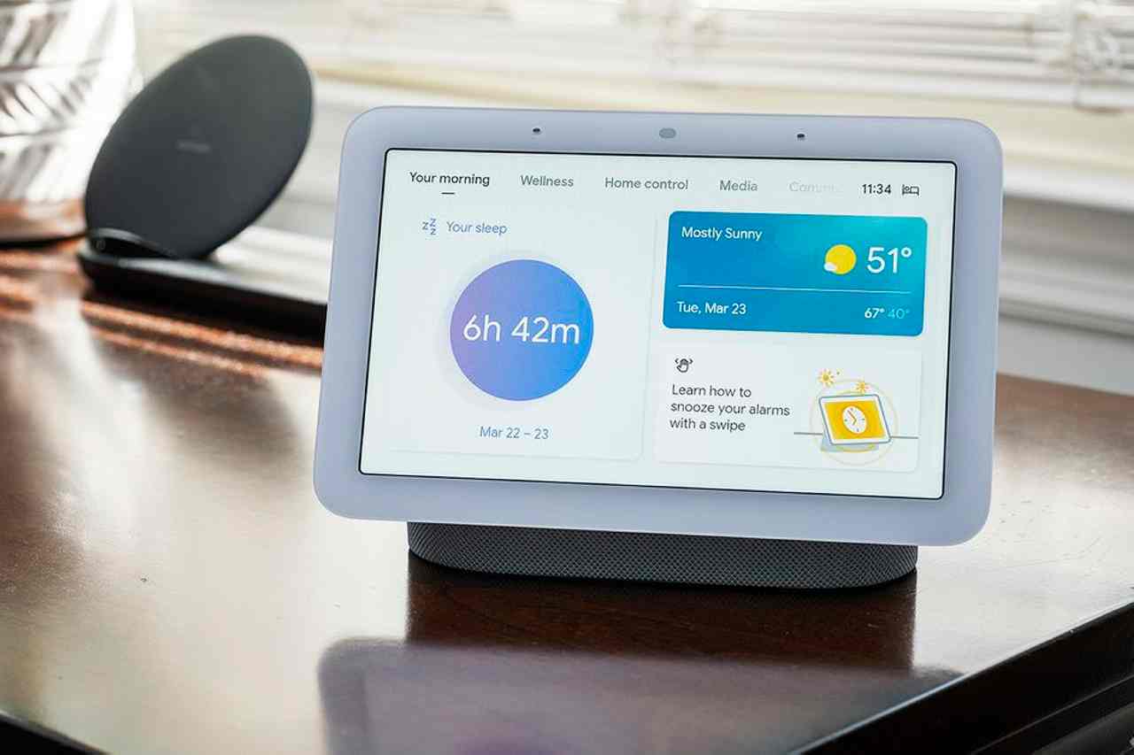
Google I/O is a couple of days away and, with it, the likely launch of the Pixel Tablet. By itself, the device is just another Android tablet, but when it’s connected to its charging dock, which has built-in speakers, it looks an awful lot like the Nest Hub Max. Like the Nest Hub Max, it can act as a smart home controller — and I sure hope it paves the way for a better smart home interface. It had better.
The Nest Hub exemplifies everything that’s gone wrong with smart home controls: its interface is unintuitive and inflexible, its responses are laggy, and its responses are unpredictable and often just plain wrong.
Google seems to be using the Pixel Tablet as a chance for a do-over. The Pixel Tablet will run Android, and from what we’ve seen so far, it lets you control your smart home directly from the Google Home app, just like you can on any other tablet or smartphone. That’s great for people who buy the Pixel Tablet; the Home app is much more powerful than the Nest Hub interface, and the updated version that’s been in public preview since November comes with powerful new features and increased flexibility.
It’s clear that Google is gearing up for a big overhaul of the Google Home ecosystem. And no part of the ecosystem needs it more than the dilapidated, half-busted Nest Hub interface.
It won’t be easy.
The trouble with the Nest Hub (abridged)
Let’s back up. Right now, Google sells two touchscreen smart displays: the Nest Hub Max, released in 2019, and the second-gen Nest Hub, from 2021. It also still supports the 2018 Nest Hub. All three run the same interface, which has always been a little bit janky but has become increasingly busted as Google adds features and removes others.
The Nest Hubs have touchscreens, which makes you feel like you ought to be able to interact with them like you would a tablet. But as my colleague Jennifer Pattison Tuohy, The Verge’s resident smart home expert, says, smart displays are really just smart speakers that can show you things: pictures of your kids, YouTube videos, your home cameras, the weather, etc.
It’s nice that they have screens. The fact that they have touchscreens is misleading, though: it’s nearly always faster and easier to talk to them than to use the touch interface, and you’re more likely to get the results you want.
For the Nest Hub, part of that is down to the design of the interface, which hasn’t meaningfully changed since 2020. The main screen has a series of tabs along the top, and each tab has a bunch of cards on it. There’s an overview page, a home control page, one for media, one for communication, and so forth. But since they have to be large enough to be seen from across the room, the information density is incredibly low, which means lots of swipes and taps to get to anything you might want to do.
Even if you can manage to navigate the interface to find the thing you want to do, there’s no guarantee the Nest Hub will actually make it happen. Instead of being hard-coded to do the thing you expect them to do, most interface elements send a simulated voice command, which it is up to Google Assistant to parse in real time, based on who’s asking.
For example, the Nest Hub has a thing that looks like an app drawer, which was added in 2021, and in that drawer is a Games icon (for now). If my editor, Dan Seifert, presses the icon on his Nest Hub Max, it opens the Games pane, which is what it’s supposed to do. If I press Games on my Nest Hub Max, it pulls up the video feed from the Nest cam in my game room, which happens to be named Game Cam. The button does not know what it is supposed to do.
Another example: half the time, the Nest Hub Max can’t hear me say “Hey Google” unless I raise my voice. There’s a slider in the Google Home app labeled “Hey Google” sensitivity. When I increased it by one level on my phone, the Nest Hub Max recited the definition of sensitivity — exactly as if I had said “Hey Google, sensitivity.” I do not know if it actually changed the mic sensitivity.
Google built Duo video calling into the Nest Hub Max, and then it merged Duo with Meet and forgot to tell the Nest Hub, which still has a Duo icon. When I tap my wife’s name in Household Contacts and select video call, the Nest Hub doesn’t know how. Earlier, I asked it to call me by tapping my own profile picture, and it dialed a completely different Nathan Edwards — one of the many guys with my name I have never met but have in my contacts because I get emails intended for them. Just now, I launched Duo from the icon. The Assistant asked, “Who do you want to call?” I said, “Me,” hoping it would send a video call to my phone. Instead, it pulled up a list of Spotify albums and playlists called “me.”
Another big issue here is that you cannot meaningfully customize the interface, either on the device or in the Google Home app. The only way to reorder rooms and devices is to rename them so they show up earlier in the alphabet. Google has finally fixed this in the public preview of the Home app, which allows you to add devices and groups as favorites and — as of a couple weeks ago — reorder them. That option has yet to appear on the Nest Hub.
When Google was pushing games on the Nest Hub, the interface was full of tiles advertising games like Feed My Fish or Baby Shark Stories. I couldn’t dismiss them. I couldn’t even move the tiles further to the right. There was nowhere in the settings where I could disable them, nowhere in the content filters to change them, etc. You could disable news, disable videos, and disable music, but there was no option to disable games.
Now that games are (thankfully) being deprecated, Google has put a News tile on my interface. Because I live in America, the News tile usually shows either celebrity nonsense or headlines about people getting shot and killed. I cannot change the sources for this News tile, and I cannot get it off of my interface.
Because of the Nest Hub Max’s limited processing power, the fact that it’s not really designed for touch, and the fact that it has to support multiple users, you have to use the Google Home app on a phone or tablet in order to change most of its settings anyway, and it’s far from clear where any given option lives. Is it in user account settings? Device settings? Assistant settings? Home settings? Nobody knows.
Take that News tile: I can open Google Home on my phone and tap the card for the Nest Hub Max. From there, I go to Notifications & Digital Wellbeing > Digital Wellbeing > Filters > Nest Hub Max (again) > News & Podcasts and tap Block news. This blocks audio news programs but doesn’t do anything about the News card.
In order to set up meaningful parental controls — which Google introduced in November 2022, more than three years after I got my Nest Hub Max — I had to create Google accounts for my elementary-aged children and teach the Nest Hub Max to recognize their faces and voices. Enabling parental controls and downtime doesn’t remove unavailable options from the Nest Hub Max. It just means that I heard “Hey Google, play Baby Shark Stories” and “I’m sorry, I can’t do that while content restrictions are on” five hundred times a week until my kids forgot about it.
There’s also a “meditations to try” tile in case I need to calm down. I’m very calm. Calmer’n you are, dude.
I could go on.
Now is the time for Google to fix its smart home interface
We know the Pixel Tablet runs Android, and we know that the Google Home app is getting an overhaul, which means the tablet will be far better positioned to do all the things I wish the Nest Hub did better. And from what we’ve seen in previews, the updated Home app itself solves most of my gripes with the Nest Hub interface — for people who buy the Pixel Tablet.
But the Nest Hubs aren’t going anywhere. Unless the Pixel Tablet has a secret Nest speaker in its charging dock — which, to be clear, would rule — you’ll still need a separate Matter controller and Thread border router for your smart home. All the Nest Hubs are Matter controllers, and the second-gen Hub and the Hub Max are also Thread border routers. While Google has other speakers and mesh nodes with Matter controllers (and exactly one other that’s also a Thread border router, the Nest Pro Wi-Fi), it’s unlikely to kill its existing smart displays just because it’s launching a new tablet.
This is the first I/O since Google incorporated Matter into Google Home, and I would be shocked if Google didn’t mention anything about it. If Google does launch the Pixel Tablet, it’s likely to bring the Google Home app update out of public preview and maybe even launch the script editor at the same time. With a new tablet, a new Home app, and a new Matter focus, it’d be deeply odd to leave the Nest Hub in its current janky state.
There’s reason to be optimistic. Google has spent the last two years replacing the Nest Hub operating system with Fuchsia OS: the first-gen Nest Hub got it in 2021, the Nest Hub Max in 2022, and the second-gen Nest Hub in May 2023. That means all three Nest Hubs will be running the same code base for the first time in two years, just before Google I/O. Why put in all that work without changing the interface? We’ve been wondering for two years. It could explain (but not excuse) the apparent neglect; why fix something that’s about to be replaced?
The groundwork is there. They’ve got to do something.
It’s a great time for a fresh start.


